A new visual language to showcase IdeaSquare’s new strategic approach
A new visual language for a new strategic approach
We are happy the new visual language of IdeaSquare has been released! It’s been an honour for wonnd agency to be commissioned for the new conceptualization and design of the IdeaSquare rebranding.
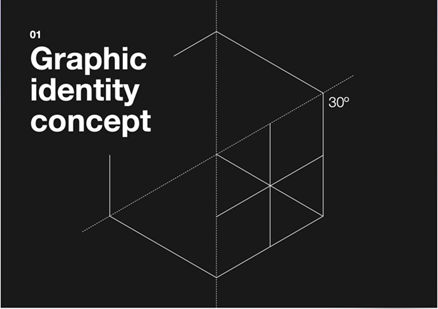
The new design showcases the ongoing evolution of IdeaSquare towards becoming the global reference for how science and society collaborate. We conceived the visual language to show IdeaSquare as an open space, with no boundaries, where people from diverse disciplines and mindsets converge to experiment and think out-of-the-box.
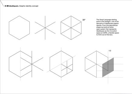
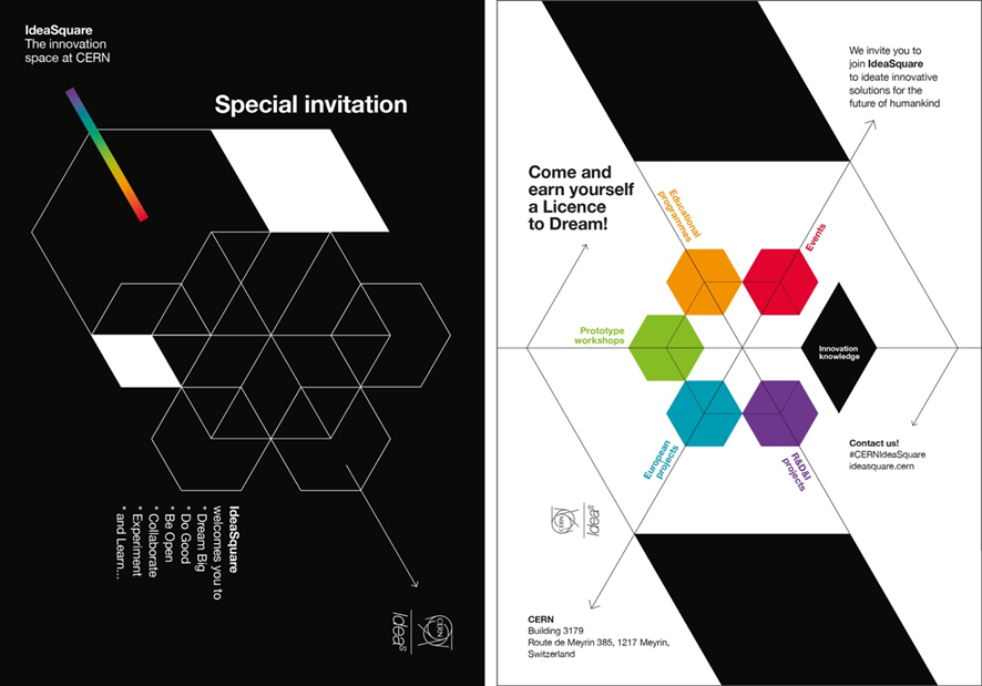
The hexagon – the previous IdeaSquare most recognizable element – was the starting point to ensure continuity between the past and the future. We deconstructed the shapes to create an elegant and precise image, while disruptive and unconventional, integrated on CERN visual communication. The elements of the new branding distinguish IdeaSquare’s approach creating images that are dynamic and changing for representing different open spaces, with multiple ways of interpretation: they switch and re-configure as IdeaSquare’s space does.


For introducing the new colours, we’ve been inspired by IdeaSquare’s commitment to CERN mission of discovering the universe that remains unknown: black and white represents the search for these 95% undiscovered. The visible colour spectrum represents the rest – this 5% that we have managed to observe is within us humans' lives– where IdeaSquare areas of action take place.


Luciana Leveratto
IdeaSquare new branding project director
wonnd agency, Barcelona